Six decades after the L.A. River was first paved, the City of Los Angeles faces an unprecedented opportunity to reverse the past and re-envision the River as the soul of the City. We had the chance to create its visual identity.
The Los Angeles River is 47.9-miles long, beginning in the Simi Hills and Santa Susana Mountains. It was once a source of life for the Tongva people and its path was often unstable and unpredictable. To control flooding, the Army Corps of Engineers completely paved the river with concrete. No native species survived the channelization.
After over 7 decades, the river has been reopened for recreation. In 2013, the Los Angeles River Revitalization Corp. announced a goal of completing a continuous 51-mile greenway and bike path along the river by the end of the decade.
The Los Angeles River has immense potential to become a beautiful space for recreation and exercise, community gatherings, tourism, and even kayaking. However, the current experience for visitors is disjointed and inconsistent among the 51-mile length, partially due to the lack of cohesive signage and visual language, and stakeholders across different cities.
The brief for the concept was to create a strong visual identity and apply it to both educational and informational signage. All elements had to factor cost efficiency, environmental, and functional concerns.
“Our communities want parks.
They want wildlife habitat.
They want neighborhood revitalization
for our families and children.”
My strategy to revitalize the river is to break up the concrete channels and restore a functioning riparian ecosystem along the river. The concrete will be re-purposed for signage, amphitheaters, pathways, and benches. What once controlled the river will create a place for various communities to recreate along the water.
Early sketches and exploration
THE LOGO
The Los Angeles River is currently represented by the Great Heron on the river. With this redesign of the logo, the intention is to convey the newly revitalized river and restored riparian ecosystem. The current of the river shows movement and life because the concrete channels have been removed and re-purposed.
THE TYPE
FF DIN is a realist sans-serif typeface designed by Albert-Jan Pool. DIN’s horizontal strokes are thinner than the vertical ones and the transitions between circles and straight lines are harmonized, resulting in better readability. This typeface is friendly, yet has a structured, modern institutional aesthetic and a variety of weights for signage of all sizes.
THE COLORS
The color palette is inspired by the water of the river, clean and clear. The colors are more blue than green to keep from referring to the ocean and are accented with a warm earthy gray. The blues, close in value, reflect the moving current.
APPLICATION
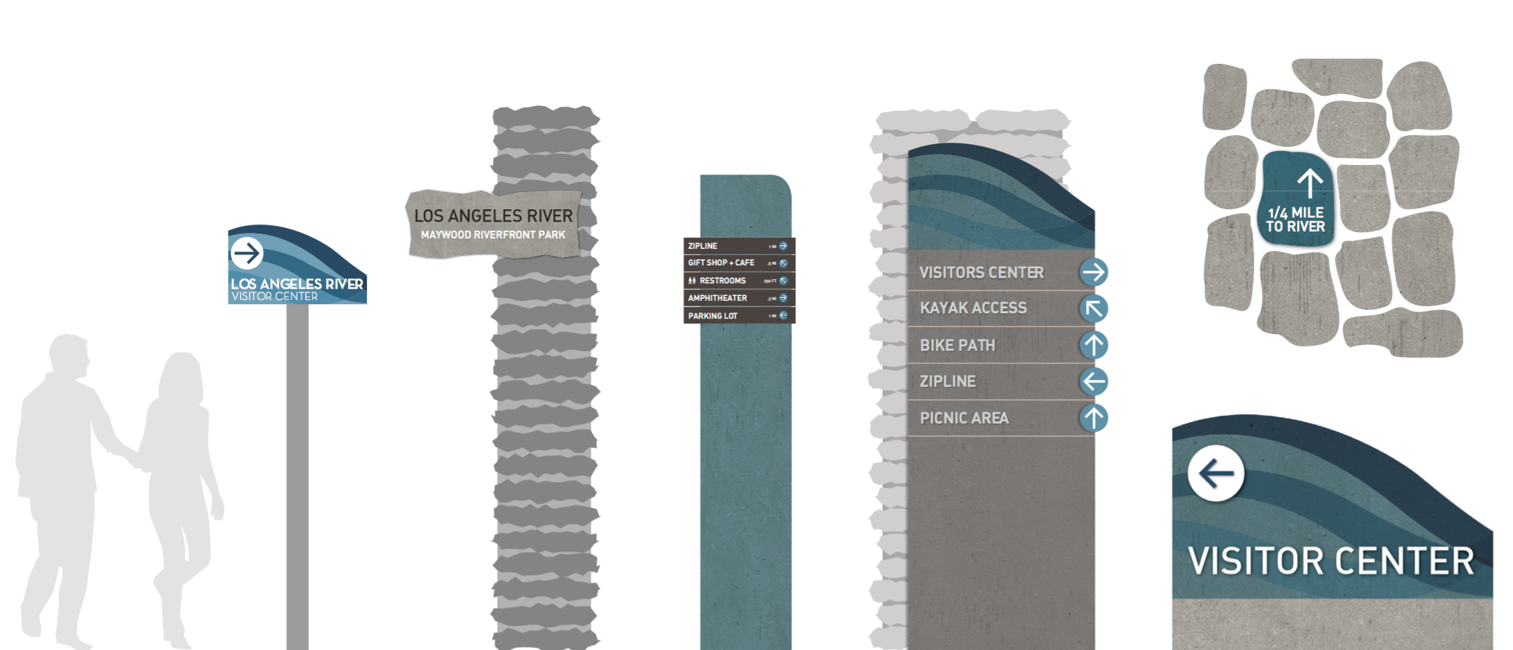
Directional signage helps visitors orient themselves in the environment and points out special attractions and facilities. These signs are made of metal and reclaimed concrete.
Lamp post signs and wall advertising
THE WEBSITE
There are many websites about the Los Angeles River run by various city agencies and non-profits. They all have their own different visions for how they want to revitalize the river with different levels of community involvement.
THE APP
This simple River Guide app is all you need to get around the river parks. The app has a map feature of the entire span, a bike route planner, a calendar for community events, and a self-guided walking tour that gives you the inside scoop on cool things along the river.
“Over two hundred years ago, the River gave life to the City of Los Angeles. We’re giving life back to the River, renewing her, transforming her back into the enchanted place she once was.”
Read my full case study and process book here.
Laguna College of Art + Design
Corporate Identity
Professor Dana Herkelrath


